Your cart is currently empty!
In this post you will find some basic illustration tips of drawing techniques to start to paint printed fabrics on Fashion Illustrations.
Being a real passionate of Fashion Illustration, I confess that I love to capture attention with my illustrations through precision in little details, especially in the realization of patterns and textures of the fabrics, because aside from being the part I most enjoy to make I think it helps to stand out the design of each garment and facilitates understanding. Moreover, I am convinced that in this profession is very important to know show clearly the ideas on paper, because allows me to comply with the expectations of customers in addition to conquer them. Well, after this short personal reflection… we started,
Some illustration tips and techniques step by step:
I start with a description of the materials that I used: Textured drawing paper 220 gsm, alcohol based ink markers, colored pencils, fineliner marker pens, white gel ink pen and some artworks of textile prints that I had developed previously.
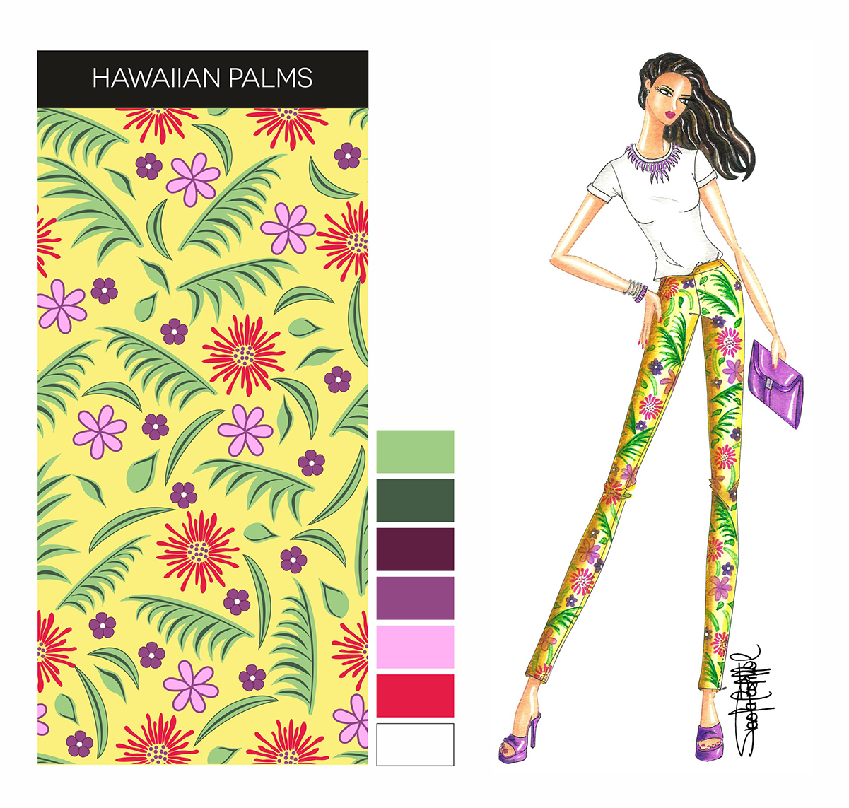
After selecting the image of the textile printing or the physical sample of the printed fabric that we want to copy in our Fashion Illustration, we must to put it near our sketch to be able to reproduce all the features of the best way. Taking as reference the Fashion Sketch presented below, the first step is to apply the lighter colored base using a marker (in this case yellow), in doing so, we must try to leave some empty spaces that will give us a light effect. After, with a marker of darker tone we have to do the side shadows and the folds that will give the effect of volume. Next, we begin to directly copy the pattern design (flowers and leaves), with markers of the most similar tones of image, calculating the distances between each element of the artwork and starting the application on a scale from light to dark colors. Then we use fineliner marker pens for the darker and thin details that we need to highlight. And finally, with colored pencils we have to give the finishing touches of shadows that will give us more depth. For those who still do not have a lot of practice, I advise you to do a soft print pattern sketch in pencil before to start to paint, this way will be easier to maintain uniformity in the dimensions and calculate the distances of each element of the pattern.
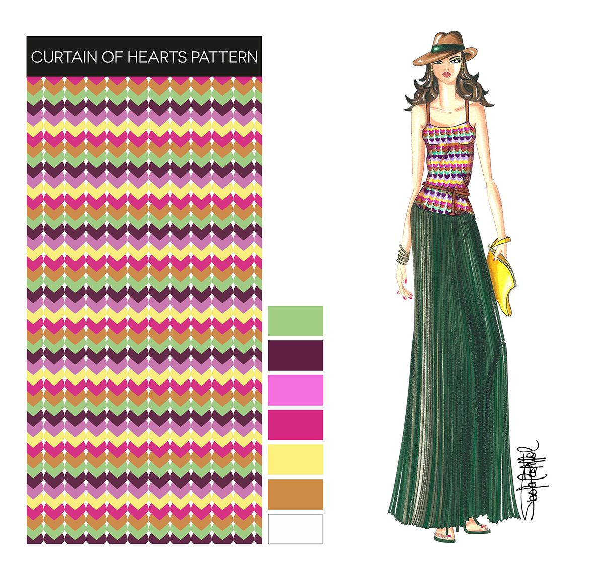
For to make the following illustration the process changes slightly, since the background is white so, there is no need to apply a base color, besides because the design of the artwork could cover most of the space, so my advice would be to copy directly the pattern with markers. Then we proceed to give intensity to the edges with fineliner marker pens and to finish we do the shadows of the garment with a neutral color marker, or as in this case where I used the color camell that matched perfectly with the total look of Fashion Illustration:
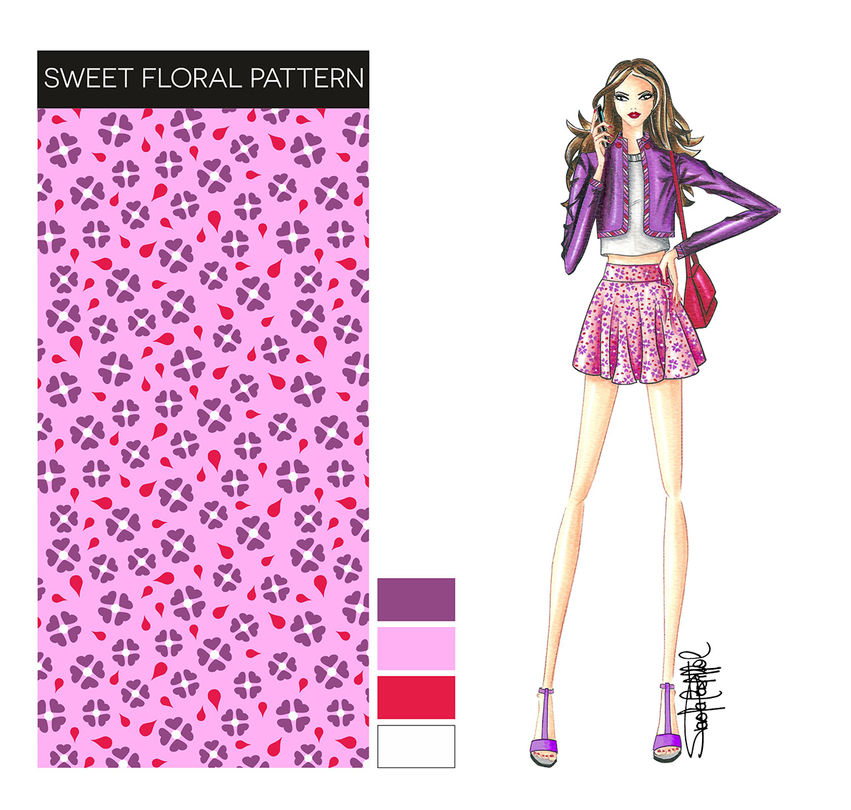
The next textile printing is very similar to the first example, the only difference are the white dots “very small size” placed in the center of the flowers, therefore, I suggest perform the same procedure described in the first example and after doing the shadows and finishing touches with colored pencils, we need to finalize the central dots of floral design with a white gel ink pen:
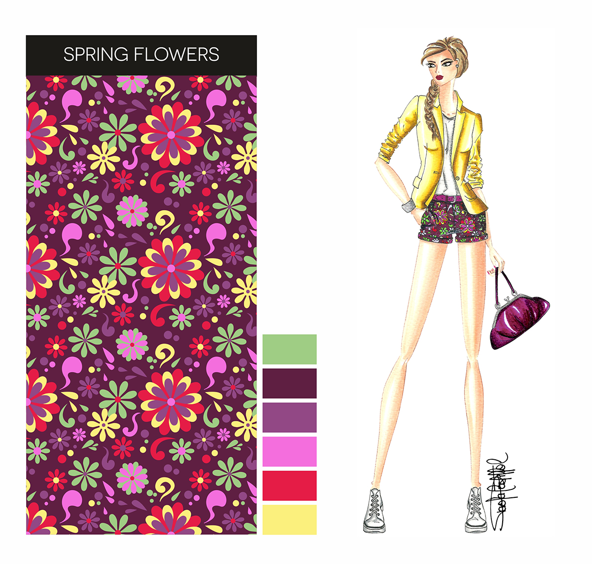
In the following case, the technic change again, because as we can see on image the inner colors of the flowers are clearer relative to the fund. So the first step is to delineate gently the outline of the pattern with a pencil and then fill the inside of the design with markers. Then, we have to paint the fund (burgundy color), avoiding to cover the work already done. Then, in the part where there are shadows and folds we have to use a darker marker (in this case I used black). Finally, with black pencil we try to intensify the shadows to give an idea of the volume and then with fineliner marker pens we highlight the edges of the design to give definition and also to cover imperfections:
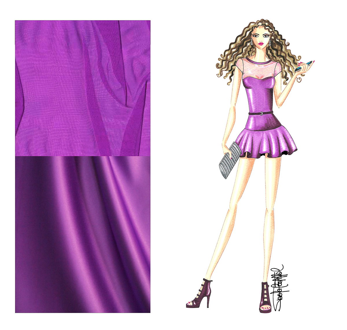
To complete this set of Illustrations, I decided to work the next Sketch focusing only on the texture of fabrics, more specifically, on the effect of transparency of the top of the dress. The first step is to apply the skin tone, leaving some small free spaces to create light effects. After we gently apply the color pencil diagonally (purple color), in this way we will see the fund of the skin tone. To give the effect of lights and shadows in the folds of the sleeves and sides, it is necessary to intensify the pressure of the hand or decrease it according to needs of the material that we’re copying:
As we can see, the secret is in the technique and the proper selection of materials of work, I mean the quality of paper that we use as a base and the rest of the elements necessary to illustrate, such as markers, colored pencils, watercolors, etc..It all depends on the effect you want to obtain and to achieve the distinction and good impression with our designs, is required some experience by practicing and experimenting with different elements and techniques. I hope this information has been useful and easy to understand… in fact, I’m starting to discover how difficult it is to do copywriting and translation for a blog… I just ask you a little patience! 🙂
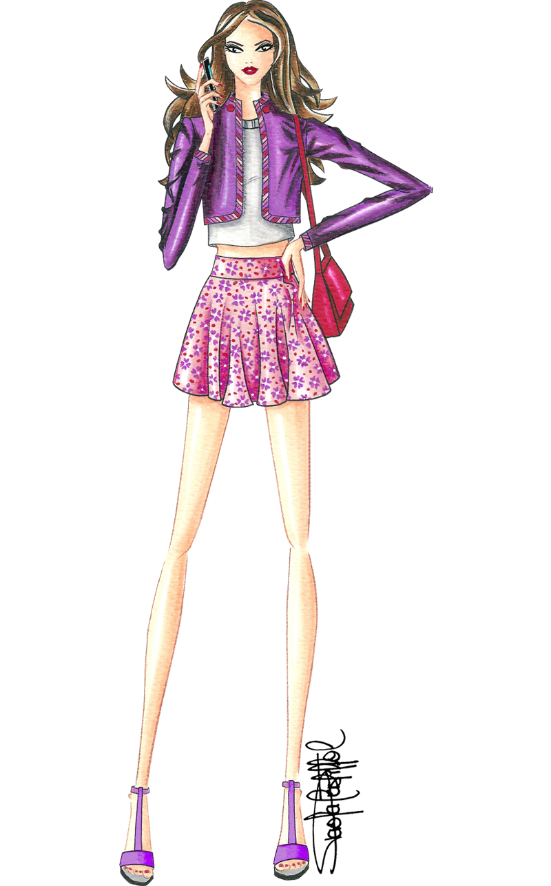
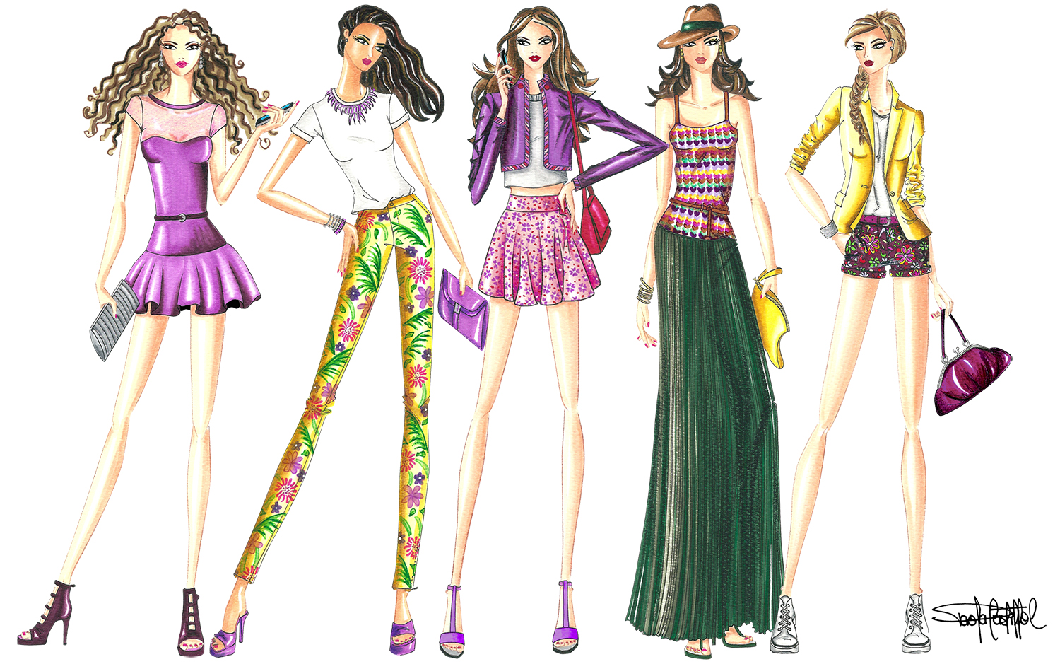
To end this post I present the complete view of the Fashion Illustration, a small proposal for the Spring/Summer 2014 season, inspired by the Street Style from a recent trip I made to the beautiful province of Veneto, Italy.
Thanks for visiting my blog and I hope to receive your comments!

Fashion and Illustration
You are welcome. Thank you for your message.
john carter
This site is good and this is very helpful and thanks for sharing this information for us.